Strong services, weak communication.
Important information was spread across long paragraphs, while services, credibility, and next steps lacked a clear hierarchy.
Mass2Miami · Website redesign
I redesigned Mass2Miami's website to make its leadership programs easier to understand, its experience easier to trust, and registration easier to find.
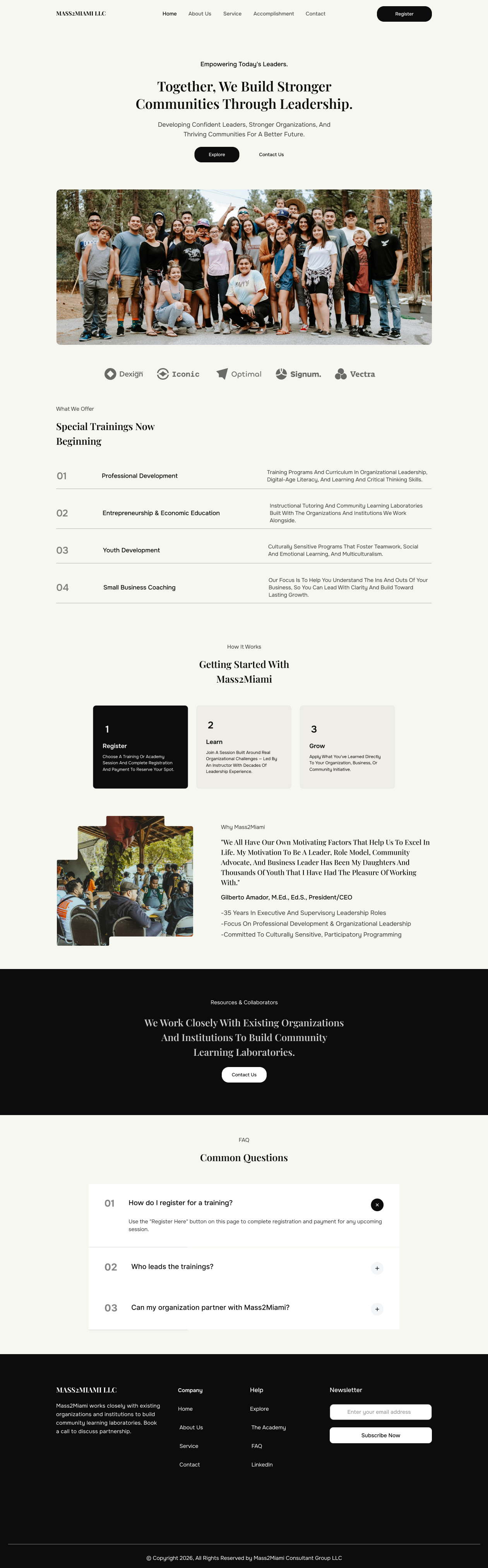
Mass2Miami supports schools, nonprofits, businesses, professionals, and communities through leadership development, education, entrepreneurship, and workforce training. The redesign focused on helping visitors understand that value before asking them to read more.
Important information was spread across long paragraphs, while services, credibility, and next steps lacked a clear hierarchy.
Create a simpler path from understanding the organisation to choosing a program, trusting its experience, and taking action.
I reviewed the live website, its content, navigation, service structure, visual hierarchy, and likely visitor journeys before defining the new experience.
The available evidence came from the existing website and its published content. I did not invent survey participants or interview results. Findings shown here are audit observations and design hypotheses that should be validated with real users.
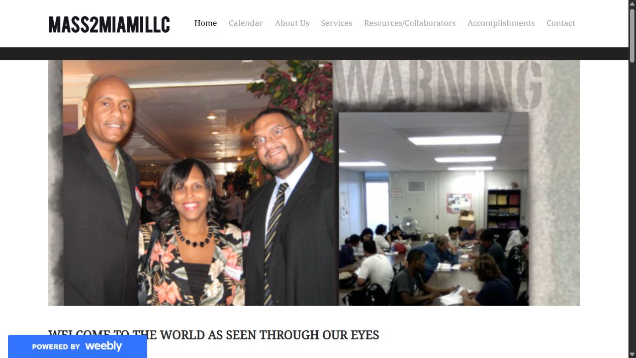
I grouped recurring observations into four themes. This helped separate surface level visual issues from the problems most likely to affect understanding and action.
Visitors needed a faster way to answer three questions: What do they offer? Why should I trust them? What do I do next?
These are proto personas based on Mass2Miami's stated audiences and services, not representations of interviewed participants. The hand drawn portraits make the audience visible while the content stays grounded in the audit.
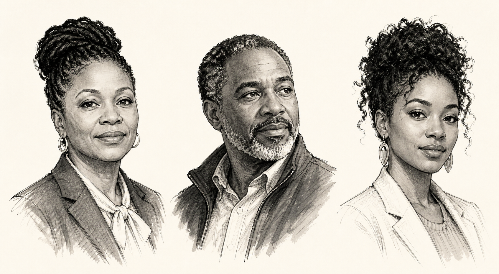
Find relevant training and confirm it suits their staff.
NeedsClear programs, outcomes, and an easy next step.
Understand Mass2Miami's experience before discussing a partnership.
NeedsVisible credibility, community impact, and tailored services.
Find practical business coaching without decoding the whole website.
NeedsScannable service choices and simple registration information.
The journey map turns audit observations into testable assumptions about what an organisation decision maker may need at each stage.
Because there was no interview frequency data, I prioritised issues using two honest dimensions: likely user impact and business importance.
I replaced the image led opening and buried welcome copy with a clear value proposition, supporting message, and two visible actions.
Instead of explaining every program at once, the redesign creates clear entry points and a simple progression from discovery to registration.
A clear value proposition, scannable services, simple next steps, and visible community leadership.
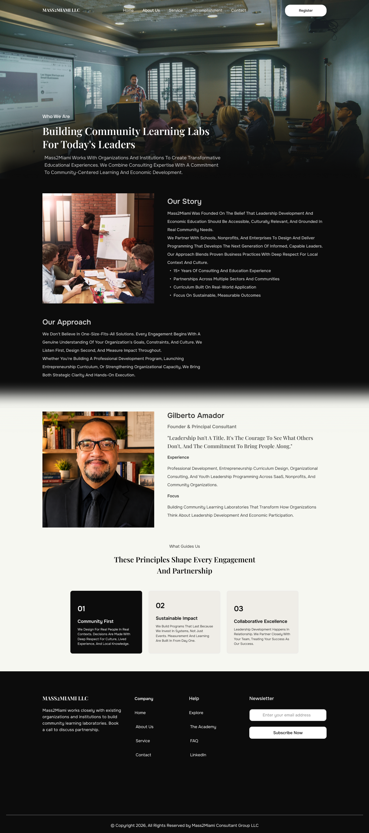
The story, founder, approach, and guiding principles make the organisation feel human and credible.
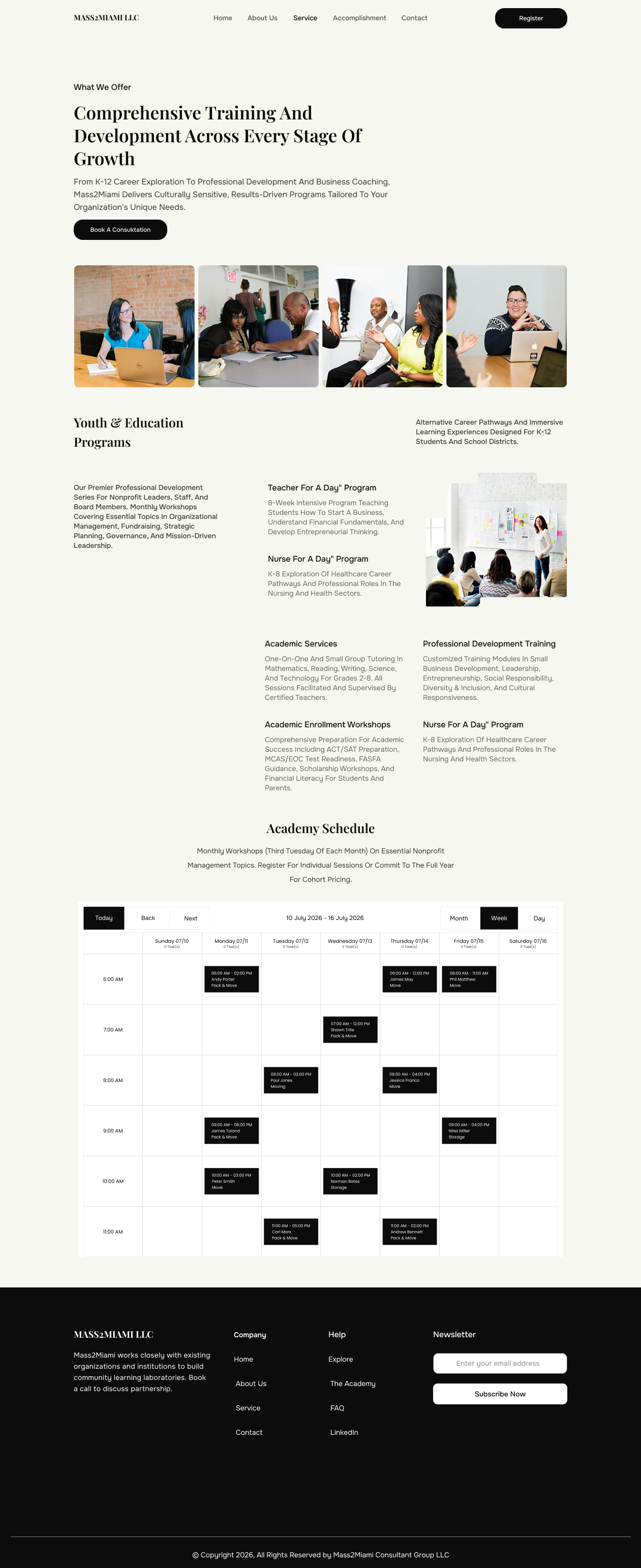
Programs are grouped around audience needs, with an Academy schedule that supports registration.
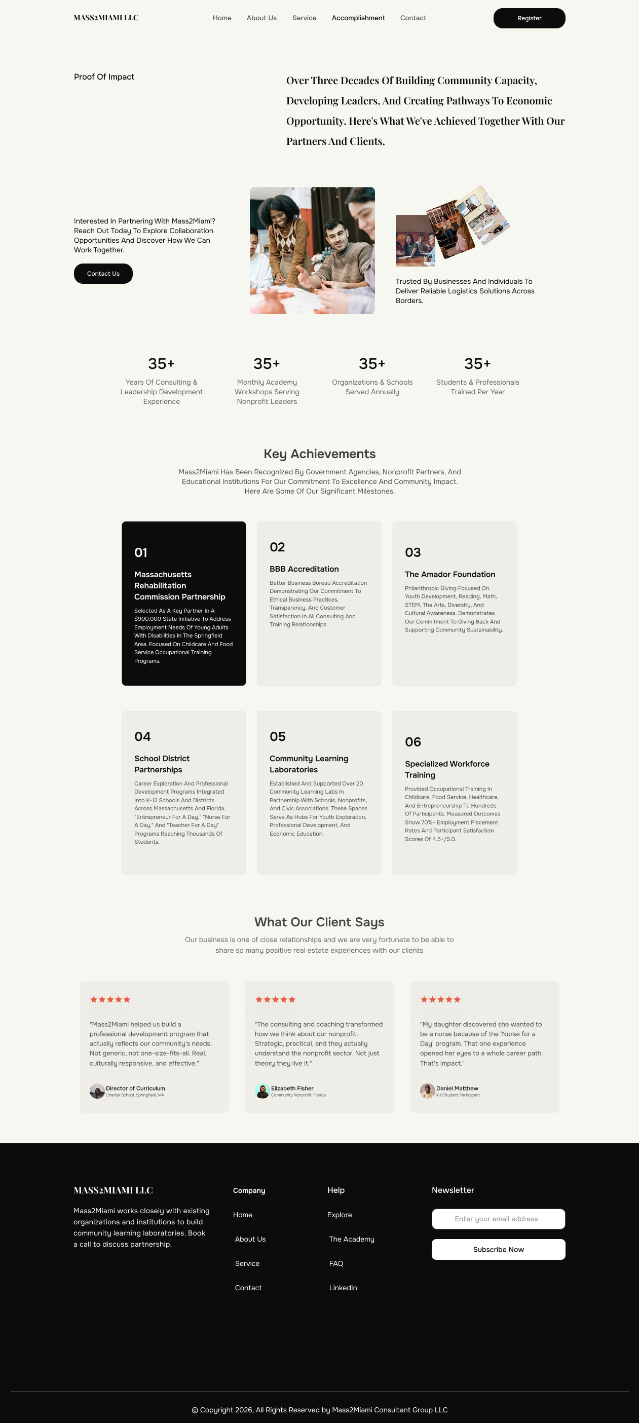
Impact metrics, achievements, and testimonials bring proof of experience into one focused story.
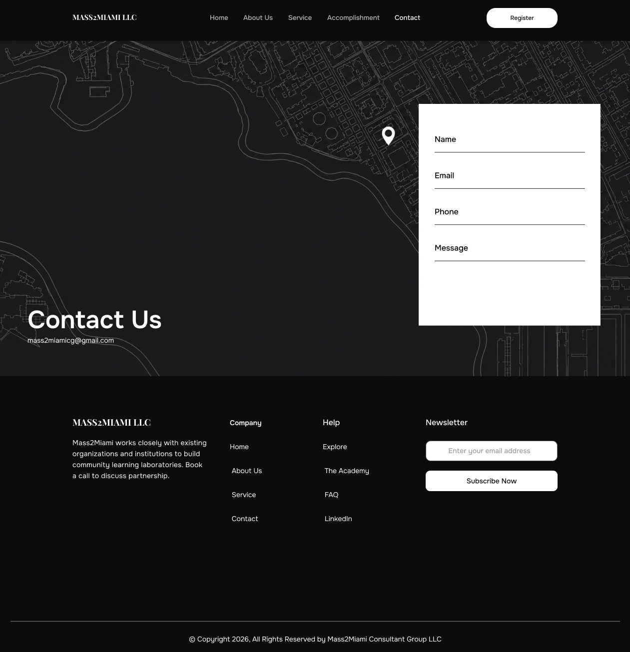
A direct contact experience makes collaboration feel like the natural final step.
Editorial confidence
A calm, approachable foundation.
Strong contrast and confident actions.
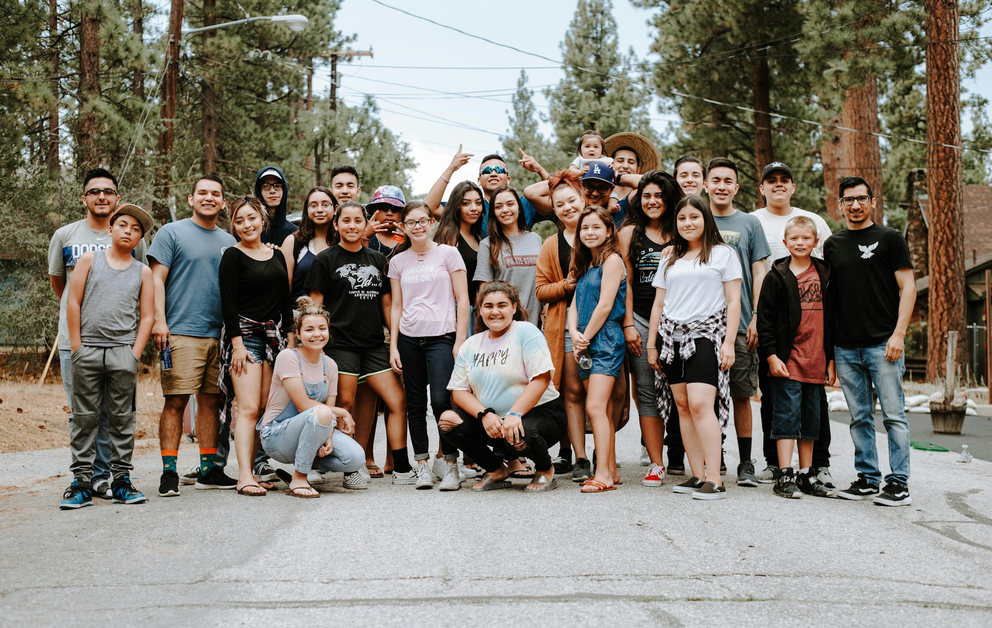 Human photography
People and participation carry the story.
I started this project thinking Mass2Miami needed a more modern website. The audit showed that the bigger problem was communication.
The organisation already had the services, experience, and purpose. My role was to make those strengths easier to see. A useful next step would be testing the prototype with school administrators, nonprofit leaders, entrepreneurs, and program participants before measuring changes in registration and consultation enquiries.
Back to selected work