Fragmented validation
Research, audience thinking, competitor evidence, and planning lived in separate workflows.
Validate AI · B2B AI product design
Validate AI brings market research, competitor analysis, audience thinking, and idea validation into one workspace. My focus was not only generating a verdict. It was making the path to that verdict visible, correctable, and useful.
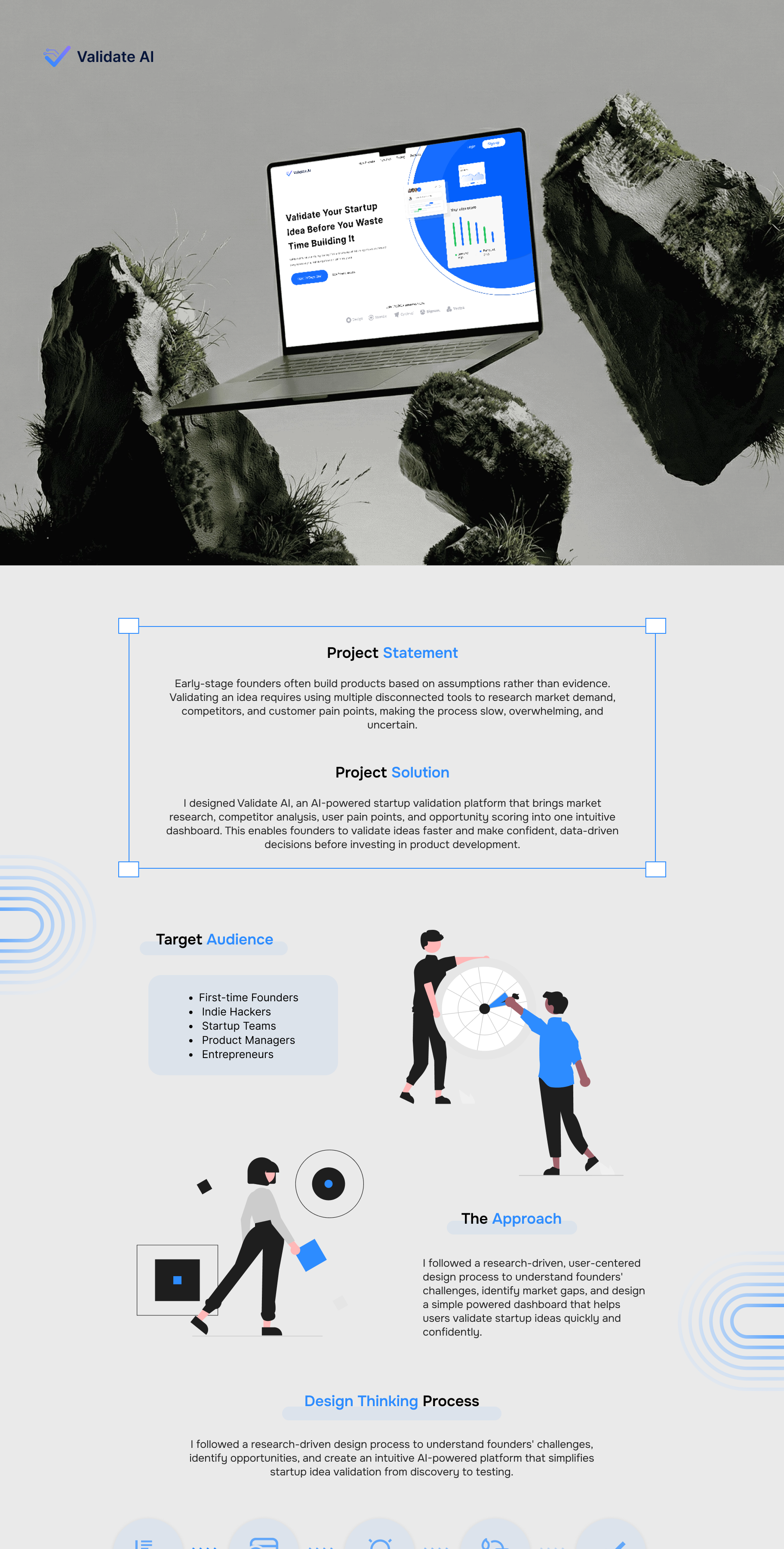 Original project artwork from Behance
The existing project statement identified a common early stage problem: assumptions are often treated as proof. Research is spread across multiple tools, competitor checks are inconsistent, and a confident looking AI answer can hide how little context supports it.
Research, audience thinking, competitor evidence, and planning lived in separate workflows.
The product needed to communicate uncertainty without making the AI feel vague or unhelpful.
I connected the research model, product flow, information hierarchy, screen system, and interaction states.
The workflow gives every AI step a visible purpose. Founders can see what is happening, what information is missing, and what decision the output is meant to support.
Capture the problem, audience, assumptions, and the decision the founder needs to make.
Ask for the information the AI needs instead of pretending it already has enough context.
Show progress across market, competitor, audience, pain point, and feasibility signals.
Separate evidence from inference and explain why a result is strong, weak, or incomplete.
Turn the result into specific actions the founder can accept, correct, or investigate further.
The original case study documents qualitative founder interviews, interview questions, competitor review, personas, an empathy map, and a task flow. I translated the recurring needs into four design requirements.
Founders move between search, trend, competitor, and planning tools before they can form one view.
People need to understand what influenced a verdict before they can trust it.
The quality of an AI recommendation rises or falls with the completeness of the founder's inputs.
A useful validation report should make the next product decision clearer, not simply generate more reading.
Recording rejected directions makes the reasoning visible. Each decision reduced ambiguity while preserving the founder's ability to inspect and correct the system.
A single pass felt fast but concealed missing evidence and made the result look more certain than it was.
Why it failedNo reasoning, no correction path, no visible evidence quality.Automatically choosing a direction reduced effort but removed the founder from an important business decision.
Why it failedLow agency and no room to challenge assumptions.Break the verdict into visible stages, surface evidence gaps, and end with actions the founder can review.
Why it workedClear status, correction, confidence, and decision support.The interface communicates what the AI is doing, what it needs, when the founder can correct it, and how the result becomes an actionable decision.
This answer improves the audience confidence score.
Name the analysis in progress and reveal the signals behind the result.
Make missing information visible and explain why the AI needs it.
Let founders edit inputs, challenge assumptions, and rerun an analysis without losing context.
Pair confidence with practical next steps, evidence gaps, and decisions to make.
Empty, loading, incomplete, low confidence, error, and complete states use the same structure so the interface remains predictable under uncertainty.
A focused prompt and example reduce blank page anxiety.
Progress labels explain what the AI is doing instead of showing an indefinite spinner.
The interface asks for missing audience and competitor context before raising confidence.
A caution state separates weak evidence from a negative verdict.
The user's draft stays safe and the retry action explains what will happen next.
The result ends with an evidence summary and prioritised actions.
Tokens connect visual language to product meaning. Component variants cover default, hover, loading, caution, error, success, and disabled behaviour for handoff.
The design system gives engineering a shared language for data states, component variants, breakpoints, and AI responses. The handoff model keeps implementation questions tied to the user's decision.
Review feasibility, data availability, and the confidence model before high fidelity work.
Document component anatomy, responsive rules, content limits, and every system state.
Compare builds against behaviour and accessibility criteria, then resolve exceptions in the system.
The final workspace uses a focused blue accent, generous white space, and a clear dashboard hierarchy. Each view helps founders move from an idea to evidence, analysis, pain points, and a report they can act on.
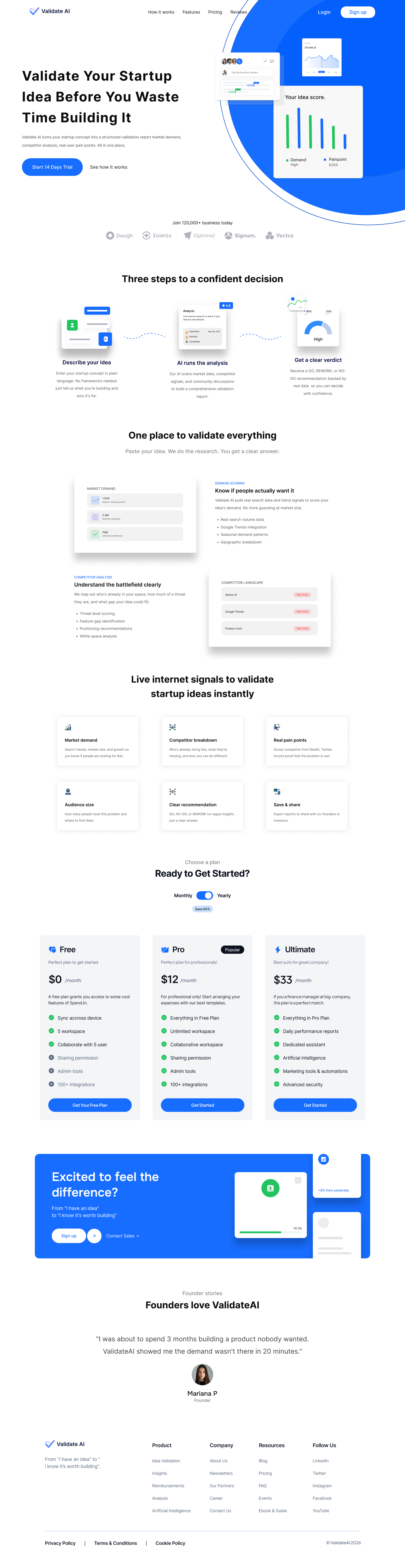
Original Figma home page design
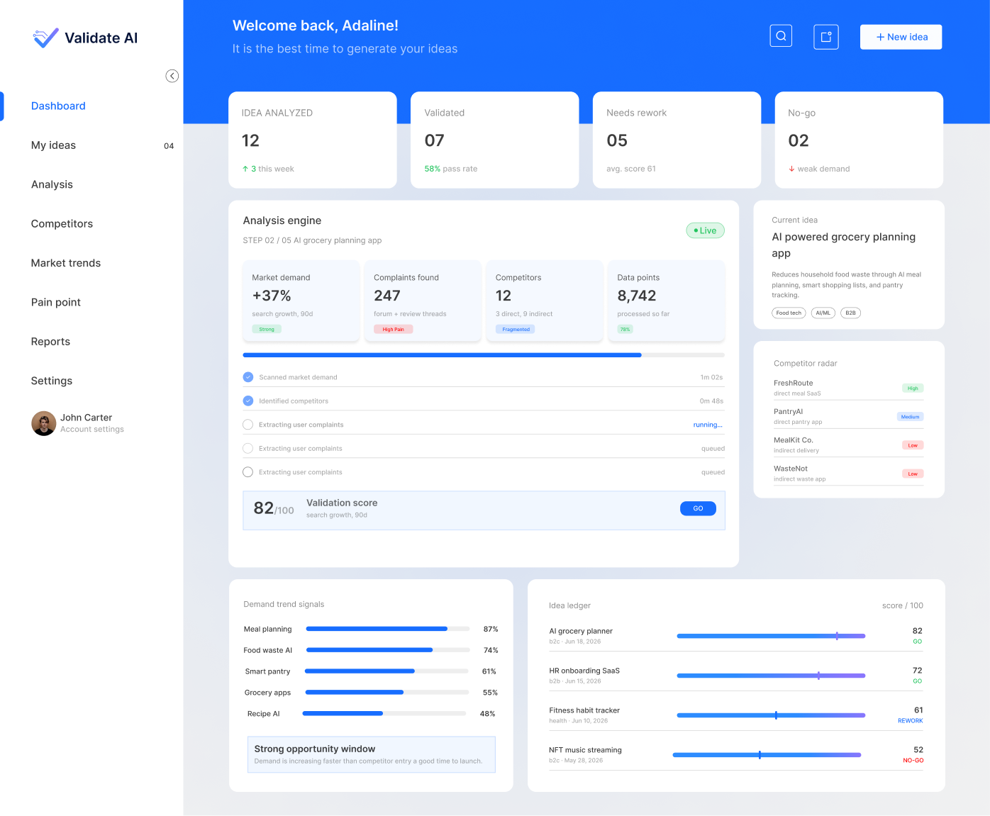
Dashboard overview and live analysis engine
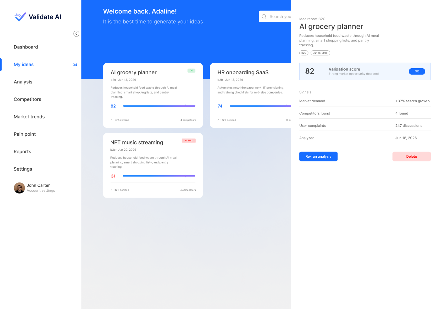
My Ideas and detailed validation report
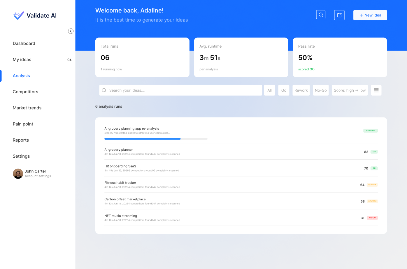
Analysis runs, progress, and result states
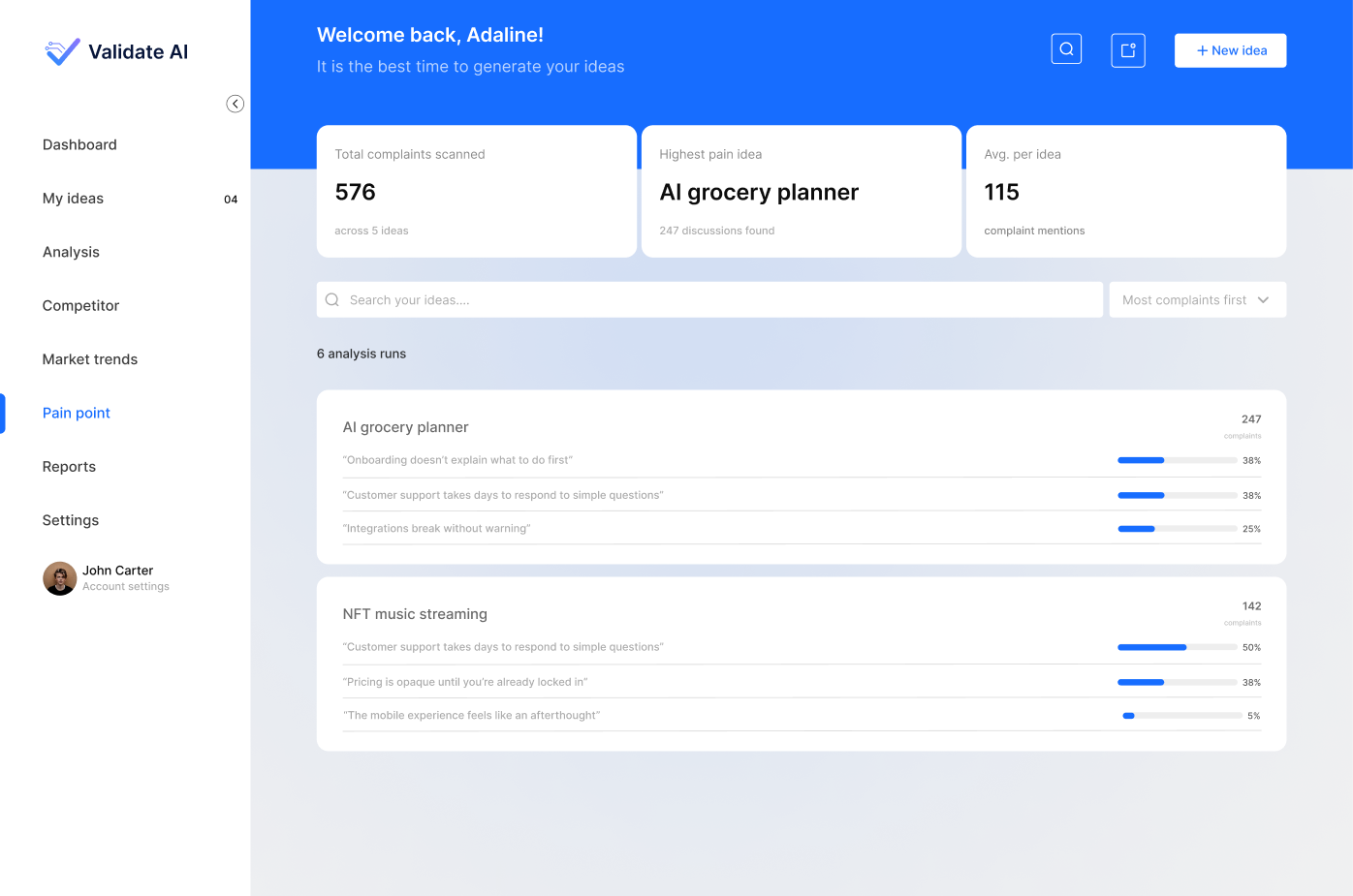
Pain point evidence and complaint patterns
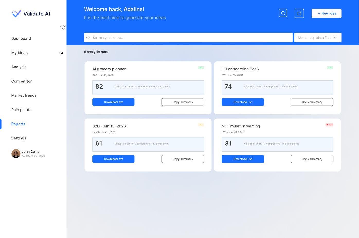
Reports, scores, downloads, and summaries
The designed experience unifies the founder journey across ideas, analysis, trends, competitors, pain points, reports, and settings. Because launch metrics were not supplied, the outcome is stated without invented conversion numbers.
Can a founder describe why the AI reached this confidence level?
Can a founder find and update an assumption that changed the result?
Can a founder choose the next evidence gathering action without guidance?
Track comprehension, correction success, time to next action, and confidence before and after explanation.

The hardest AI design problem was not producing an answer. It was helping someone understand, correct, and act on that answer.
Validate AI shows how I approach AI product design as a trust system: transparent status, evidence aware confidence, meaningful correction, reusable states, and a clear path from insight to action.
Back to selected work